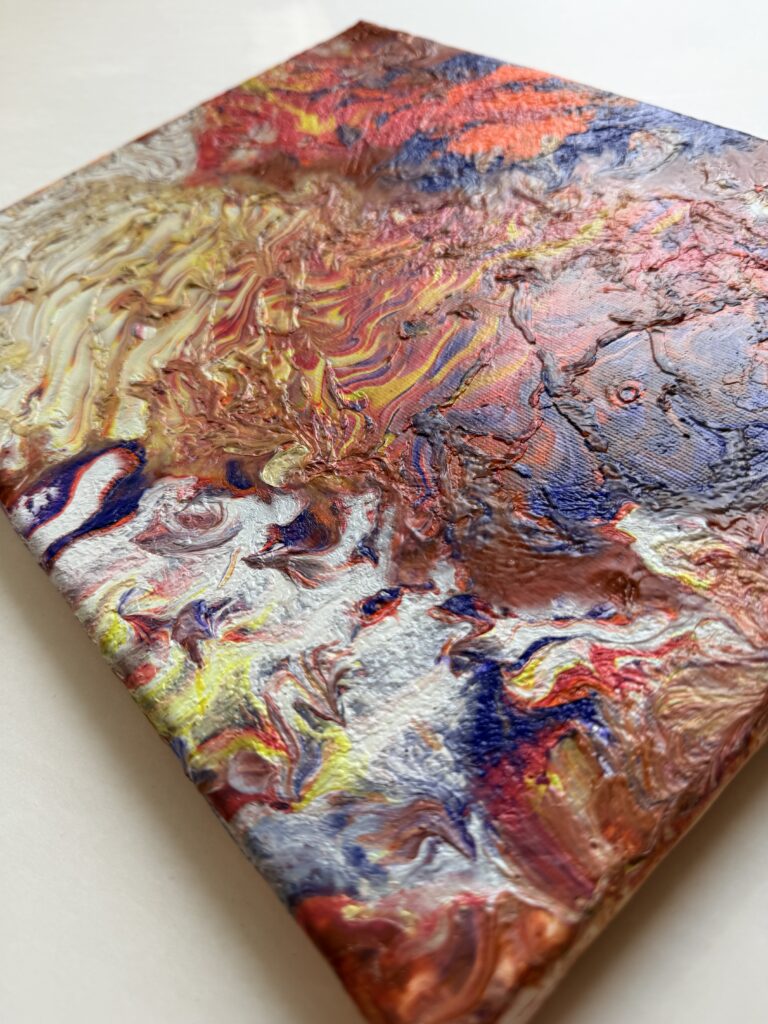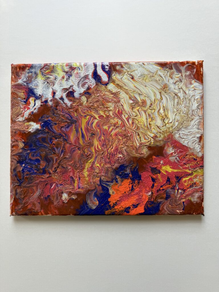

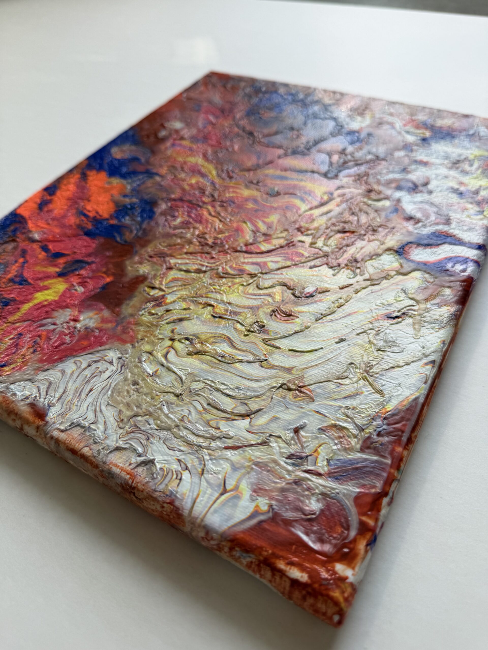
The choice of colors is one of the most fundamental aspects of abstract painting. The color wheel is your best friend: it allows you to identify complementary colors (opposite colors on the wheel, such as blue and orange) that create a vibrant and dynamic contrast, and analogous colors (neighboring colors on the wheel, such as green, blue-green, and blue) that produce a soft, calming harmony. Understanding these relationships will give you a solid foundation for composing visually balanced works.
Beyond the rules, abstract painting invites you to listen to your emotions: warm hues (red, orange, yellow) evoke energy and passion, while cold hues (blue, purple, green) convey serenity and depth. Don’t hesitate to integrate touches of black and gold to anchor your composition and give it a luxurious dimension. The secret lies in balance: let one color dominate, a second sustain and a third accentuate to give rhythm to your painting.